Building a Logo That Sells: Lessons from 15+ Brand Identities
What I've learned creating brand identities for startups to established businesses over 15 years. Real insights from real projects.
Key Insight
Frequent redesigns, no brand equity
Long-term investment, builds brand equity
Logo Lifespan: Professional design lasts 10x longer
Over the past 15 years, I've created brand identities for everything from fishing tackle companies to healthcare tech startups. Each logo tells a different story, serves a different purpose, and faces unique challenges. Here's what I've learned about what actually works.
What Makes a Logo Successful?
A successful logo isn't just visually appealing—it's a strategic business asset. After designing 15+ brand identities, I've found that effective logos share these characteristics:
It Communicates Instantly
Your logo has about 2 seconds to make an impression. The best logos I've created communicate the brand's essence immediately:
- Industry recognition: Viewers should instantly know what category you're in
- Emotional connection: The right shapes, colors, and typography evoke specific feelings
- Memorable simplicity: Complex logos get forgotten; simple ones stick
Real Example: When I designed the Rumble Fish Tackle & Lure logo, the aggressive fish imagery immediately communicated "fishing" and "performance tackle" without requiring explanation.
It Works Everywhere
A logo that only looks good on your website is a failed logo. Modern brands need marks that work:
- On business cards and billboards
- In full color and black-and-white
- At 16 pixels and 16 feet
- Embroidered on apparel
- As social media avatars
Design Tip: I always test logos at extreme sizes—favicon size (16x16px) and billboard scale. If it doesn't work at both extremes, it needs refinement.
It Has Strategic Color
Color isn't decoration—it's psychology and strategy. Here's what I've learned about color choices:
Industry Expectations:
- Healthcare: Blues and greens (trust, health, calm)
- Food: Reds and oranges (appetite, energy)
- Tech: Blues and grays (innovation, reliability)
- Finance: Blues and blacks (trust, authority)
Breaking the Rules: Sometimes the best strategy is going against industry norms. If every competitor uses blue, your brand might benefit from a strategic color departure—but only if it still communicates the right message.
Common Logo Design Mistakes
After seeing what works, here are the mistakes I see businesses make repeatedly:
1. Following Trends Over Timelessness
The Trap: Designing a logo in whatever style is currently trendy (gradient overlays, flat design, etc.)
The Problem: Trends change every 3-5 years. Your logo should last 10-20 years minimum.
The Solution: Focus on classic design principles—balance, proportion, simplicity. Add contemporary touches in brand applications, not the core mark.
2. Designing for Yourself, Not Your Audience
The Trap: Creating a logo that appeals to your personal aesthetic
The Problem: Your customers might have completely different preferences and expectations
The Solution: Research your target audience. What visual language do they respond to? What do they expect from your industry?
Real Example: For healthcare brands, I've learned that "creative" often takes a backseat to "trustworthy" and "professional." The audience dictates the approach.
3. Over-Complicating the Design
The Trap: Adding too many elements, effects, or details
The Problem: Complex logos:
- Don't scale well
- Aren't memorable
- Cost more to reproduce
- Look dated quickly
The Solution: Simplify ruthlessly. Remove everything that isn't essential. Then remove a bit more.
4. Ignoring Practical Applications
The Trap: Designing a beautiful logo without considering how it will actually be used
The Problem: Logos need to work:
- In single color (for stamps, engraving, embroidery)
- At tiny sizes (favicons, app icons)
- With and without taglines
- On various backgrounds
The Solution: Design with applications in mind from day one. Create variations for different use cases.
My Logo Design Process
Here's the exact process I use for every brand identity project:
Phase 1: Discovery (Week 1)
What I Do:
- Deep dive into business goals and target audience
- Research competitors and industry standards
- Identify what makes this brand unique
- Establish design direction and strategy
Deliverable: Strategy brief outlining design direction
Phase 2: Concept Development (Week 2)
What I Do:
- Sketch 20-30 rough concepts
- Select 3-5 strongest directions
- Refine chosen concepts digitally
- Test at various sizes and applications
Deliverable: 3-5 initial concepts with rationale
Phase 3: Refinement (Week 3)
What I Do:
- Present concepts to client
- Gather feedback on strongest directions
- Refine chosen concept(s)
- Perfect proportions, spacing, alignment
- Test in real-world applications
Deliverable: 1-2 refined logo options
Phase 4: Finalization (Week 4)
What I Do:
- Final revisions based on client feedback
- Create all logo variations (full color, single color, horizontal, vertical, icon-only)
- Develop brand style guide
- Prepare final files in all formats
Deliverable: Complete brand identity package
Logo Types and When to Use Each
Different businesses need different logo styles. Here's my framework for choosing:
Wordmarks (Text-Only Logos)
Best For: Brands with distinctive or memorable names
Advantages:
- Clear brand name communication
- Simple to reproduce
- Professional appearance
Real Projects: Used this approach when the business name itself was the strongest brand asset
Icon + Wordmark Combinations
Best For: Most businesses—offers flexibility
Advantages:
- Versatile (can use icon alone or full lockup)
- Memorable visual element plus clear name
- Works across most applications
Real Projects: This is my most common recommendation—about 60% of my brand identity projects use this format
Icon-Only Marks
Best For: Established brands with high recognition
Challenges:
- Requires significant brand awareness to work alone
- Not ideal for new businesses
- Harder to communicate name
When I Use It: Primarily as a secondary mark for established brands, rarely as the primary logo for new businesses
The Business Value of Professional Logo Design
Beyond aesthetics, a professional logo delivers real business value:
Immediate Credibility
The Reality: People judge businesses by their visual presentation. A professional logo signals:
- You're serious about your business
- You invest in quality
- You understand your market
- You're established and trustworthy
Brand Recognition
The Math: Consistent logo usage across all touchpoints increases brand recognition by 80% (according to industry studies).
Marketing Efficiency
The Benefit: A strong logo makes all other marketing more effective:
- More memorable ads
- Higher social media engagement
- Better website conversion
- Stronger brand recall
Long-Term Investment
The Value: A well-designed logo lasts 10-20 years. At $2,000-5,000 for professional design, that's $100-500 per year for a critical business asset.
Typography in Logo Design
The text in your logo carries as much weight as any graphic element. Here's what I've learned about typography:
Serif vs. Sans-Serif
Serif (with decorative strokes):
- More traditional, established feeling
- Good for: Law, finance, luxury, heritage brands
Sans-Serif (clean, modern):
- Contemporary, approachable feeling
- Good for: Tech, healthcare, modern services
My Approach: The choice depends on your brand positioning, not personal preference.
Custom vs. Standard Fonts
Custom Typography:
- Completely unique to your brand
- More expensive and time-intensive
- Worth it for major brands
Modified Standard Fonts:
- More affordable
- Can still be distinctive with modifications
- My recommendation for most small businesses
Color Psychology in Practice
Here's how I actually use color psychology in logo design:
Primary Color Selection
Blue: Trust, professionalism, stability
- Use for: Tech, healthcare, finance, professional services
- Avoid for: Food (suppresses appetite), highly creative fields
Red: Energy, passion, urgency
- Use for: Food, sports, entertainment, sale-focused businesses
- Avoid for: Healthcare (too aggressive), meditation/wellness
Green: Growth, health, nature
- Use for: Environmental, wellness, finance (money), organic products
- Avoid for: Tech (can feel dated), luxury brands
Orange: Friendly, enthusiastic, affordable
- Use for: Children's brands, food, creative services
- Avoid for: Corporate, luxury, serious professional services
Color Combinations
My Framework:
- One primary color: 80% of brand usage
- One secondary color: 15% for accents and variety
- Neutrals: 5% for text and backgrounds
When to Rebrand vs. Refresh
Not every brand needs a complete redesign. Here's how I advise clients:
Logo Refresh (Update, Don't Replace)
When:
- Current logo is solid but feels slightly dated
- Business evolution doesn't require new positioning
- Strong existing brand recognition
What to Update:
- Typography refinement
- Color palette modernization
- Simplified details
- Improved proportions
Complete Rebrand
When:
- Significant business pivot or expansion
- Logo is fundamentally flawed
- No existing brand equity to preserve
- Negative brand associations
What Changes:
- New concept from scratch
- New positioning and messaging
- Complete visual system overhaul
DIY vs. Professional Design
Let me be honest about when you actually need professional design:
When DIY Might Work
- Very early startup with zero budget
- Testing a business concept
- Internal projects or hobbies
- Temporary placeholder only
Reality Check: Even in these cases, you'll likely need professional design once the business shows traction.
When You Need a Professional
- Launching publicly
- Competing in established markets
- B2B services (credibility is crucial)
- Any business where trust matters
- When you're ready to grow
The Cost: Professional logo design typically ranges from $1,500-5,000 for small businesses. Enterprise brands invest $10,000-100,000+.
File Formats You Actually Need
When you work with a professional designer, you should receive:
Vector Files (Scalable)
- .AI (Adobe Illustrator source file)
- .EPS (universal vector format)
- .SVG (web vector format)
Raster Files (Pixel-Based)
- .PNG (transparent background, web use)
- .JPG (photos, prints)
- Various sizes (favicon to print quality)
Specialized Formats
- .PDF (documents, printing)
- .ICO (website favicon)
Important: If your designer doesn't provide vector files, you don't truly own a scalable logo.
Protecting Your Brand Investment
Once you have a professional logo, protect it:
Brand Style Guide
Create a simple guide covering:
- Approved logo variations
- Color codes (RGB, CMYK, HEX, Pantone)
- Typography specifications
- Minimum size requirements
- Clear space rules
- Incorrect usage examples
Trademark Consideration
When to Trademark:
- You're in a competitive market
- Your brand name/mark is distinctive
- You plan to grow significantly
- You're investing heavily in the brand
Cost: $250-2,000+ depending on complexity and legal help needed
Real Results from Professional Logo Design
Here's what actually happens when businesses invest in professional branding:
Increased Perceived Value
Clients consistently report that professional logos allow them to:
- Charge higher prices
- Attract better clients
- Compete with larger businesses
- Stand out in crowded markets
Better Marketing Performance
Professional branding improves:
- Social media engagement (15-30% higher)
- Website credibility (lower bounce rates)
- Email open rates (branded emails perform better)
- Overall brand recall
Long-Term Cost Savings
While professional design costs more upfront:
- Lasts 10-20 years vs. 1-2 for DIY
- Reduces need for frequent redesigns
- Works across all applications (one-time investment)
- Supports business growth without constant tweaking
Conclusion
After creating 15+ brand identities, I've learned that successful logo design isn't about following formulas or trends—it's about understanding businesses, audiences, and strategic communication. A logo isn't just a pretty picture; it's a business tool that should work as hard as you do.
The best logos are:
- Simple enough to be memorable
- Strategic enough to communicate clearly
- Flexible enough to work everywhere
- Timeless enough to last decades
Whether you're launching a new brand or refreshing an existing one, invest in professional design. Your logo is often the first impression potential customers have of your business—make it count.
Ready to Create Your Brand Identity?
I specialize in creating strategic brand identities for businesses in the Mid-Atlantic region and beyond. Each project starts with understanding your business goals and target audience, ensuring your logo works as a true business asset.
Looking for logo design or complete brand identity services? I work with startups to established businesses, creating marks that are memorable, strategic, and built to last. Let's discuss your project.
Tags

About Kevin Wolff
Kevin is a web developer and digital strategist based in Ocean City, MD. He specializes in creating modern websites, SharePoint solutions, and digital marketing strategies that help businesses grow online.
Free: AI Readiness Checklist
Subscribe and instantly download our 15-question checklist to discover where AI automation can save you time and grow your business.
Related Articles
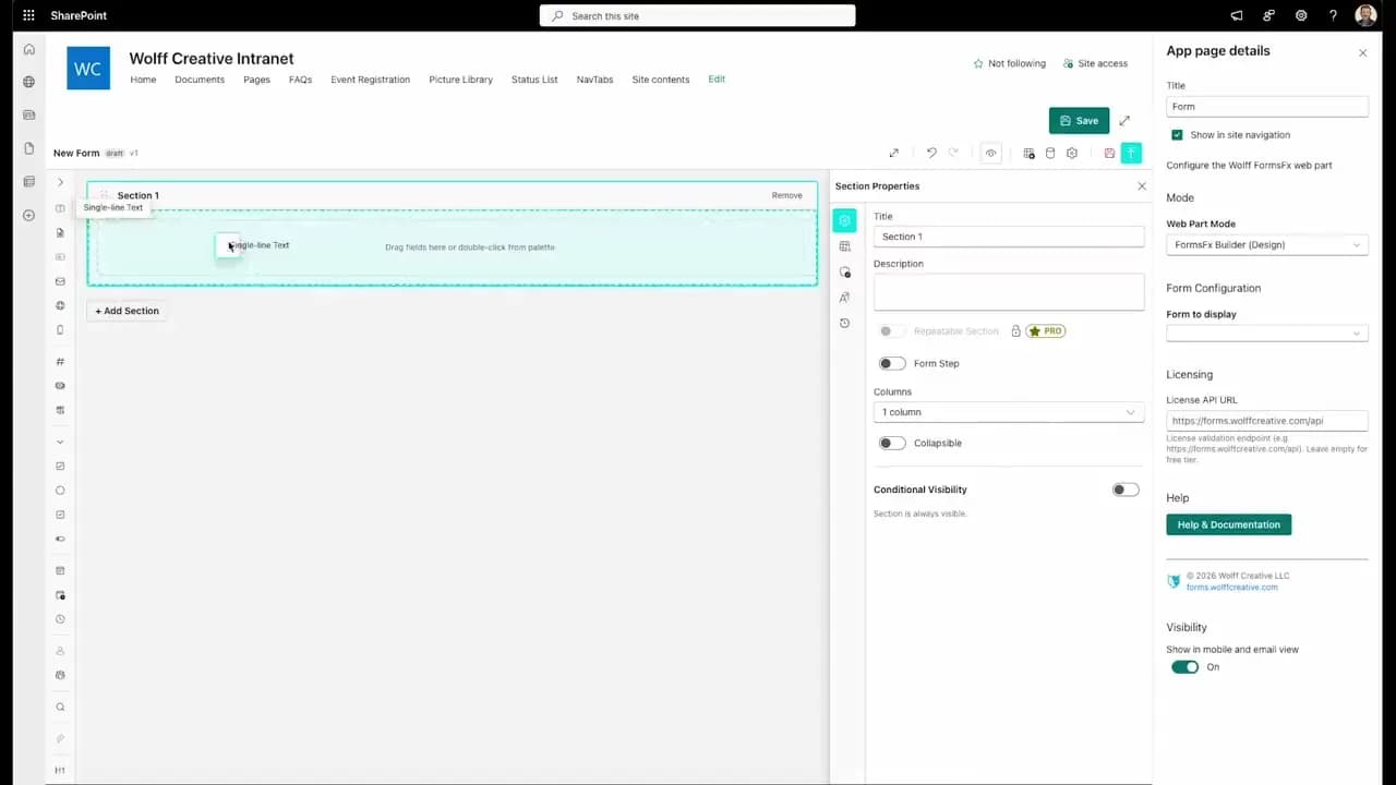
FormsFx: A Drag-and-Drop SharePoint Form Builder with Rules, Formulas, and Cascading Dropdowns
We built a SharePoint form builder that does what InfoPath did — conditional logic, calculated fields, cascading dropdowns — but runs natively as an SPFx web part. Here's how it works under the hood.
Read More →
FormsFx Has a Built-In Submissions Dashboard — Here's Why That Matters
Most SharePoint form builders stop at form submission. FormsFx includes a full dashboard for managing, searching, filtering, exporting, and approving submissions — no Power BI or custom views required.
Read More →
Offline Forms, Webhook Signatures, and Enterprise Connectors — FormsFx Beyond SharePoint Lists
FormsFx doesn't just write to SharePoint lists. It supports offline submission queuing, HMAC-signed webhooks for Power Automate, and enterprise connectors for SQL Server, Dataverse, REST APIs, and Azure Service Bus.
Read More →Need Help With This?
I help Eastern Shore businesses with web development, marketing, and AI automation. Let's talk about your project.
Need Help With Your Project?
Ready to take your business to the next level? Let's discuss how I can help.