Logo Design Process: How Professional Designers Actually Work
An honest look inside the professional logo design process from discovery to delivery. Real workflows, tools, and techniques from 15 years of brand identity work.
The Four-Week Logo Design Process
Discovery & Research
Week 1Before touching design software, I spend a full week understanding the business and market.
- Client Discovery: 2-3 hour session covering business fundamentals, brand personality, practical considerations
- Competitive Analysis: Study 10-15 competitors' logos
- Mood Board: Visual inspiration and direction
- Strategic Brief: One-page document guiding all decisions
Concept Development
Week 2- Sketching: 20-30 rough concepts on paper
- Digital Exploration: Bring top 3-5 into Adobe Illustrator
- Typography: Test 5-10 typefaces per concept
- Color: Develop 2-3 variations per concept
Client Presentation & Refinement
Week 3I present 3-5 distinct concepts, each fully developed with rationale and context mockups.
Not Helpful: "I don't like it"
Finalization & Delivery
Week 4- Final Refinement: Pixel-perfect precision
- File Preparation: 20+ files in all formats
- Usage Guidelines: Brand style guide
- Color Specs: HEX, RGB, CMYK, Pantone
What You're Paying For
After 15 years creating brand identities—from fishing tackle companies to healthcare tech startups—I've learned that great logo design isn't about magical inspiration. It's about process, discipline, and asking the right questions. Here's how professional logo design actually works.
The Four-Week Process
Professional logo design typically takes 3-4 weeks from kickoff to final delivery. Here's why it takes that long and what happens during each phase.
Week 1: Discovery & Research
Before touching design software, I spend a full week understanding the business and market.
Client Discovery Session (2-3 hours)
Questions I Always Ask:
-
Business Fundamentals
- What problem does your business solve?
- Who are your ideal customers?
- What makes you different from competitors?
- What's your long-term vision (5-10 years)?
-
Brand Personality
- If your brand was a person, how would you describe them?
- What 3-5 adjectives define your brand?
- What emotions should your logo evoke?
- What should it definitely NOT communicate?
-
Practical Considerations
- Where will the logo appear most often?
- Do you need it to work in single color?
- Are there industry symbols to embrace or avoid?
- Any specific colors required or forbidden?
Real Example: When designing for Rumble Fish Tackle, the discovery revealed they wanted "aggressive performance" rather than "friendly fishing." This single insight shaped the entire direction toward bold, dynamic visuals.
Competitive Analysis
I analyze 10-15 competitors' logos:
- What patterns exist? (Colors, symbols, typography)
- What opportunities exist? (Gaps in visual approach)
- What should we avoid? (Overused clichés)
- What's expected vs. what's differentiated?
Documentation: I create a visual board showing competitor logos with notes on strengths, weaknesses, and opportunities for differentiation.
Mood Board Development
I assemble visual inspiration from:
- Industry leaders in related fields
- Aspirational brands clients admire
- Typography that matches brand personality
- Color palettes that evoke desired emotions
- Imagery that captures brand essence
Purpose: This isn't about copying—it's about establishing a shared visual language with the client before design begins.
Strategic Brief
I synthesize everything into a one-page brief:
Business: [One sentence description]
Audience: [Primary and secondary]
Differentiation: [What makes them unique]
Personality: [3-5 core attributes]
Visual Direction: [Design approach]
Constraints: [Technical or industry requirements]
Success Metrics: [How we'll know it works]
This document guides every design decision that follows.
Week 2: Concept Development
With strategy defined, I move into visual exploration.
Sketching (The Most Important Step)
I start on paper, not in software. Always.
Why Sketching Matters:
- Speed: Explore 20-30 ideas in an hour
- Freedom: No software constraints limiting creativity
- Iteration: Easy to refine and combine ideas
- Focus: Shapes and concepts, not colors and effects
My Sketching Process:
-
Divergent Phase (1-2 hours)
- Sketch 20-30 quick concepts
- Don't judge, just explore
- Mix abstract and literal
- Try obvious and unusual
-
Selection (30 minutes)
- Identify 5-8 strongest directions
- Look for versatility and scalability
- Consider strategic brief fit
- Mark concepts worth refining
-
Refinement (2-3 hours)
- Develop selected sketches
- Explore variations
- Test different compositions
- Combine strong elements
Tools: Pencil, pen, marker—whatever lets me think fastest. I use grid paper to keep proportions consistent.
Digital Exploration
I bring the strongest 3-5 concepts into Adobe Illustrator.
Initial Digitization:
- Create basic vector shapes
- Establish proper proportions
- Test at multiple sizes (16px to full screen)
- Verify scalability and clarity
Refinement Iterations:
- Adjust spacing and alignment
- Perfect curves and angles
- Test positive and negative space
- Ensure geometric precision
Typography Integration:
- Explore 5-10 typefaces per concept
- Test custom lettering if appropriate
- Balance with icon/symbol (if applicable)
- Ensure readability at all sizes
Color Exploration
For each concept, I develop 2-3 color variations:
Primary Palette:
- Choose 1-2 primary colors based on:
- Psychology (what emotion does it evoke?)
- Industry (what's expected vs. different?)
- Application (will it work everywhere?)
- Competition (how do we stand out?)
Supporting Colors:
- Black and white versions
- Grayscale for texture
- Secondary accent colors
- Ensure accessibility (WCAG AA contrast)
Testing Contexts:
- On white background
- On black background
- On photography
- At favicon size
- On product packaging
Week 3: Client Presentation & Refinement
I present 3-5 distinct concepts, each fully developed.
Presentation Format
For Each Concept, I Show:
- The Logo: Full color, black, white versions
- Scale Test: From business card to billboard
- Context: Mockups on real applications
- Rationale: Why this direction fits the strategy
- Variations: Horizontal, stacked, icon-only versions
Mockup Applications:
- Business cards
- Website header
- Social media profile
- Product packaging (if applicable)
- Signage or vehicles
- Apparel
Why This Matters: Clients need to see logos in context, not just on a white artboard. Real applications reveal issues and opportunities.
Feedback Collection
I guide clients through structured feedback:
Not Helpful: "I don't like it" Helpful: "It feels too playful for our professional services business"
Not Helpful: "Can you make it pop?" Helpful: "Our target audience is 50+ executives, this feels too trendy"
Not Helpful: "Try different colors" Helpful: "Blue conveys trust, which is critical for financial services"
Revision Round
Based on feedback, I refine 1-2 preferred directions:
- Address specific concerns
- Explore requested variations
- Test alternative typography
- Adjust colors if needed
- Show before/after to demonstrate changes
Typical Revisions:
- Simplifying complex concepts
- Adjusting colors for better application
- Refining typography spacing
- Creating additional lockup options
- Developing icon-only variations
Week 4: Finalization & Delivery
Once the concept is approved, I prepare comprehensive files.
Final Refinement
Pixel-Perfect Precision:
- Align all elements to pixel grid
- Perfect curves and angles
- Optimize anchor points
- Remove unnecessary complexity
- Test at extreme sizes
Technical Optimization:
- Clean up vector paths
- Expand all strokes to fills
- Outline all typography
- Simplify where possible
- Ensure file compatibility
File Preparation
Vector Files (Scalable, Essential):
- logo.ai          (Adobe Illustrator source)
- logo.eps         (Universal vector)
- logo.svg         (Web vector)
- logo.pdf         (Print/universal)
Raster Files (Pixel-Based, Specific Sizes):
PNG (Transparent Background):
- logo-4000px.png  (Print quality)
- logo-2000px.png  (Large web)
- logo-512px.png   (Social media)
- logo-256px.png   (Standard web)
- logo-128px.png   (Thumbnails)
- logo-64px.png    (Small icons)
- logo-32px.png    (Favicons)
- logo-16px.png    (Favicon)

JPG (White Background):
- logo-4000px.jpg
- logo-2000px.jpg
- logo-512px.jpg
Specialized Formats:
- logo.ico         (Website favicon)
- logo-og.png      (1200x630 for social sharing)
Color Specifications
I document every color in multiple formats:
For Each Color:
- HEX: #1A2B5A (Web)
- RGB: 26, 43, 90 (Screen)
- CMYK: 100, 80, 30, 20 (Print)
- Pantone: PMS 281 C (Spot color printing)
Why Multiple Formats?: Different applications require different color systems. A logo that looks perfect on screen might print poorly without CMYK values.
Usage Guidelines
I create a simple brand guide covering:
1. Logo Variations
- Primary logo (when to use)
- Alternative layouts (stacked, horizontal)
- Icon-only version (minimum size, contexts)
2. Clear Space
- Minimum margins around logo
- Visual examples of correct spacing
3. Minimum Sizes
- Print: 0.5 inches minimum
- Digital: 32 pixels minimum
- Explanation of why
4. Correct Usage
- Approved color combinations
- Acceptable backgrounds
- Proper placement examples
5. Incorrect Usage
- Don't stretch or distort
- Don't change colors
- Don't add effects or shadows
- Don't rotate or tilt
- Don't use low-resolution versions
Visual Examples: I show both correct and incorrect usage with actual mockups, not just text rules.
Tools and Software
Design Software
Adobe Illustrator (Primary):
- Industry-standard vector tool
- Precise control over paths and shapes
- Best for logo work
- Exports to all needed formats
Alternatives:
- Affinity Designer: Affordable, professional
- Sketch: Mac-only, good for simple logos
- Figma: Browser-based, collaborative
Why Illustrator?: Vector precision, industry compatibility, universal file support.
Mockup Tools
Adobe Photoshop: For realistic mockups and presentations Figma: For web/app mockups MockupWorld/Placeit: For quick presentation mockups
Testing Tools
Size Testing:
- Export at 16x16px to test favicon legibility
- Print at 0.25 inches to test minimum size
- View on phone from 6 feet to test visibility
Color Testing:
- WebAIM Contrast Checker (accessibility)
- Print test on different printers
- View on multiple screens
Application Testing:
- Test on various backgrounds
- Test in grayscale/black and white
- Test reversed (white on dark)
- Test embroidered/screen printed
Common Challenges and Solutions
Challenge 1: Client Wants to Use Their Favorite Color
Problem: Personal color preferences don't always serve brand strategy.
Solution: Show competitive analysis demonstrating color saturation in the industry. Present strategic color choice with clear rationale tied to business goals. If they insist, create a version in their color alongside strategic options for comparison.
Real Example: A healthcare client wanted orange because "it's energetic." I showed that all competitors used blue (trust) or green (health). We used blue-green to balance trust with vitality—client was thrilled with the strategic approach.
Challenge 2: "Make It Look Like [Famous Brand]"
Problem: Clients sometimes want to emulate successful brands.
Solution: Explain that imitation creates confusion and legal risk. Extract the principles that make the reference successful (simplicity, confidence, clarity) and apply those to a unique concept. Show how the best brands are distinctive, not derivative.
Challenge 3: Multiple Stakeholders with Conflicting Opinions
Problem: Design by committee leads to watered-down results.
Solution:
- Establish one decision-maker upfront
- Use the strategic brief to settle disagreements
- Show how each opinion conflicts with others
- Guide conversation back to business goals, not personal taste
Challenge 4: "Can We See More Options?"
Problem: Clients sometimes want to see 10-20 concepts.
Solution: Explain that more options create decision paralysis. Three to five strong, distinct concepts representing different strategic directions provide meaningful choice without overwhelming. Quality over quantity always wins.
Challenge 5: Revision Loops
Problem: Endless tweaks without clear direction.
Solution:
- Define revision limits upfront (2-3 rounds typical)
- Require consolidated, specific feedback
- Reference strategic brief for each revision
- Charge for excessive revisions beyond agreement
Pricing Professional Logo Design
Professional logo design isn't cheap, and it shouldn't be.
Investment Ranges
Small Business: $1,500 - $3,000
- 3-5 initial concepts
- 2 revision rounds
- Complete file package
- Basic usage guidelines
Established Business: $3,000 - $7,500
- 5+ concepts
- 3 revision rounds
- Comprehensive file package
- Detailed brand guidelines
- Mockups and presentations
Enterprise/Complex: $7,500 - $25,000+
- Extensive research
- Multiple concept directions
- Multiple stakeholder presentations
- Complete brand identity system
- Comprehensive guidelines
- Rollout support
What You're Paying For
Not just the final logo, but:
- Strategic discovery and research
- 20-30+ hours of design exploration
- Professional design expertise
- Multiple revision rounds
- Complete file package (10-20+ files)
- Usage guidelines
- Ongoing support
Comparison:
- DIY logo makers: $20-50 (limited, generic)
- Freelance marketplace: $100-500 (inconsistent quality)
- Professional designer: $1,500-25,000+ (strategic, custom, comprehensive)
Why the Range?
Pricing depends on:
- Business size and budget
- Industry complexity
- Number of stakeholders
- Deliverables needed
- Timeline constraints
- Designer experience
Red Flags to Avoid
Designer Red Flags
Run if they:
- Deliver in 1-2 days (no real process)
- Show only one concept (take it or leave it)
- Skip discovery entirely (guessing, not strategizing)
- Provide only JPG files (not professional)
- Don't include usage rights (legal issues ahead)
- Can't explain design decisions (no strategy)
Process Red Flags
Warning signs:
- No written agreement or contract
- Unclear pricing or scope
- No strategic brief or discussion
- Skipping research phase
- Unlimited revisions (never ends)
- No file specifications
DIY vs. Professional: When to Hire
When DIY Might Work
- Very early startup testing concept
- Internal project or hobby
- Temporary placeholder
- Extremely limited budget (<$500)
Reality: Most businesses outgrow DIY logos quickly and end up paying for professional design later anyway.
When You Need a Professional
- Launching publicly
- B2B or professional services
- Competing in established market
- Need investor credibility
- Plan to trademark
- Will use across many applications
- Brand represents significant investment
ROI Consideration: A professional logo used for 10-20 years at $3,000 costs $150-300/year. Poor logo redone every 2-3 years costs more and damages brand equity.
Trademark Considerations
When to Trademark
Consider trademarking if:
- You're in a competitive market
- Your name/mark is distinctive
- You plan significant brand investment
- You want legal protection
Process:
- Search existing trademarks
- Work with IP attorney
- File application ($250-500 government fees)
- Wait 6-12 months for approval
Designer's Role: I design logos to be trademarkable (distinctive, not generic) but recommend clients consult IP attorneys for legal advice.
File Formats Explained
Vector vs. Raster
Vector (Scalable):
- Made of mathematical paths
- Scale infinitely without quality loss
- Edit individual elements
- Small file sizes
- Required for professional printing
Raster (Pixel-Based):
- Made of pixels
- Fixed resolution
- Can't scale up without quality loss
- Larger file sizes
- Used for web and specific applications
When to Use Each Format
AI/EPS/SVG (Vector):
- Professional printing
- Sign making
- Embroidery digitizing
- Large format (billboards, vehicles)
- Editing and modifications
PNG (Transparent Raster):
- Website headers
- Email signatures
- Social media profiles
- Presentations
- Digital documents
JPG (Solid Background Raster):
- Social media posts
- Digital publications
- Quick sharing
- Print documents (if high resolution)
ICO (Icon):
- Website favicon (browser tab icon)
Long-Term Logo Success
A professional logo should last 10-20+ years. Here's how to ensure longevity:
Build for Timelessness
Avoid:
- Trendy effects (gradients, 3D, bevels)
- Overly complex details
- Too many colors
- Dated typography
- Meme-able concepts
Embrace:
- Simple, clear forms
- Limited color palette (1-3 colors)
- Classic or custom typography
- Timeless symbols
- Strategic concepts
Plan for Evolution
Logos can evolve without complete redesign:
Refreshing vs. Redesigning:
- Refresh: Update typography, refine shapes, modernize colors (keep core concept)
- Redesign: Start over with new concept (complete rebrand)
When to Refresh:
- 10-15 years old and feeling dated
- Minor tweaks improve functionality
- Expanding to new applications
- Simplifying for digital/small sizes
When to Redesign:
- Business fundamentally changed
- Logo is actively harming brand
- No existing brand equity to preserve
- Major repositioning required
Conclusion
Professional logo design isn't about artistic inspiration—it's a strategic, systematic process that takes real time and expertise. From discovery research through final file delivery, every step serves the goal of creating a mark that represents your business effectively for years to come.
The four-week process (discovery, concepts, refinement, delivery) ensures thorough exploration, strategic alignment, and professional execution. Shortcuts in any phase compromise the final result.
Whether you're launching a new brand or refreshing an existing one, understanding how professional designers work helps you:
- Evaluate designer expertise
- Set realistic timelines and budgets
- Participate effectively in the process
- Recognize the value of strategic design
- Make informed decisions about your brand
A logo isn't just a pretty picture—it's a strategic business asset that should work as hard as you do.
Ready to Create Your Professional Logo?
I work with businesses across the Mid-Atlantic region and beyond, creating strategic brand identities that stand the test of time. Every project starts with understanding your business, your audience, and your goals.
Get a Free Brand Identity Quote
Looking for a logo designer or graphic designer for your business? I create strategic, professional brand identities through a proven process that delivers results. Let's discuss your project.
Tags

About Kevin Wolff
Kevin is a web developer and digital strategist based in Ocean City, MD. He specializes in creating modern websites, SharePoint solutions, and digital marketing strategies that help businesses grow online.
Free: AI Readiness Checklist
Subscribe and instantly download our 15-question checklist to discover where AI automation can save you time and grow your business.
Related Articles
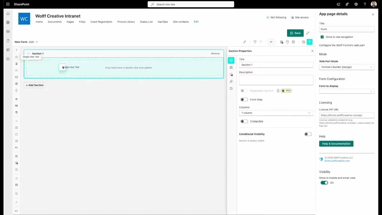
FormsFx: A Drag-and-Drop SharePoint Form Builder with Rules, Formulas, and Cascading Dropdowns
We built a SharePoint form builder that does what InfoPath did — conditional logic, calculated fields, cascading dropdowns — but runs natively as an SPFx web part. Here's how it works under the hood.
Read More →
FormsFx Has a Built-In Submissions Dashboard — Here's Why That Matters
Most SharePoint form builders stop at form submission. FormsFx includes a full dashboard for managing, searching, filtering, exporting, and approving submissions — no Power BI or custom views required.
Read More →
Offline Forms, Webhook Signatures, and Enterprise Connectors — FormsFx Beyond SharePoint Lists
FormsFx doesn't just write to SharePoint lists. It supports offline submission queuing, HMAC-signed webhooks for Power Automate, and enterprise connectors for SQL Server, Dataverse, REST APIs, and Azure Service Bus.
Read More →Need Help With This?
I help Eastern Shore businesses with web development, marketing, and AI automation. Let's talk about your project.
Need Help With Your Project?
Ready to take your business to the next level? Let's discuss how I can help.